Hello there! It’s Sandy Allnock, and it feels like it’s been a while since I visited this blog! I hope you’ve all had a great summer – filled with lots of ART! I’m here to enable you with a little bit more, are you ready?

The Colorado Craft Company has some brand new FRUIT in this month’s release – and the cool part about BIG images is that you can really get into the coloring on a grand scale! I’ve made cards with each that are A-2 size (4.25″ x 5.5″) so you can see the size of each stamp; see notes on each of the pics after the video about what I’ve done for the card designs.
But – before then let’s get the coloring underway! Watch the video below or click HERE to see it directly on YouTube.
There are sooooo many colors for each of these, and they’re all on-screen in the video….but you can use whatever yellows and greens YOU own. Try them out in different combinations! Mixing pink with green provided some really interesting transitions on the pear! The tile walls were done in warm greys (stamped in No Line Ink) – but you could do the same stamping them in a very pale color (dye inks are most often Copic-safe) and coloring them the same way with a coordinating light Copic or colored pencil. Fussy cut the pear, pop it on some dimensional tape, color in a little shadow – badaboom badabing!


I love that several of these stamp sets have sentiments that can be stamped right on the fruit – they fit horizontally or vertically! In the case of the lemon, I wanted the leaves to hang off the side – so cut the card base so it’s a skinnier card, allowing the stamped image to peek out. I also laid the stamp on the card base in the miniMISTI at the angle I wanted it, then stamped the sentiment so IT would be straight – since making it horizontal “within” the lemon would make it crooked at the angle I wanted it placed on the card.


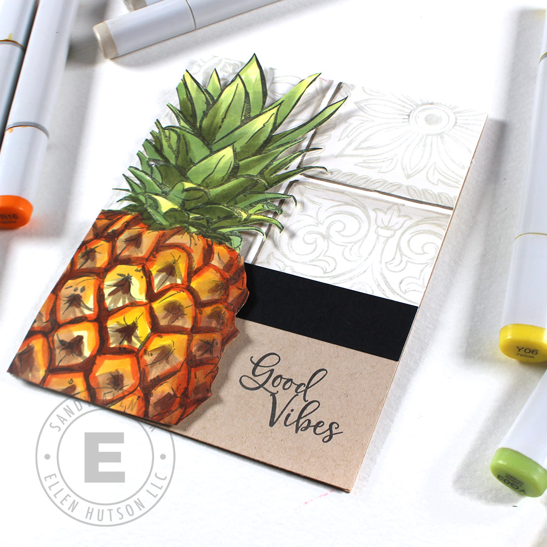
This pineapple card gives a better look at my tile design – I used black strips of cardstock to anchor the tiles, and it’s pretty striking! The pineapple doesn’t fully fit on an A2 card – but just having part of the image on it doesn’t bother me one bit! (If you remember my giant half-cupcake cards, you’ll know I’ve done this before!)

For someone who really doesn’t like eating avocados, this one was fun to color! I stamped the “avo” and embossed it in white, with the rest of the sentiment phrase in the black ink on the desert storm card base.


I love making sets of cards like these – I get my coloring jam on once and get a bunch of cards made. They’d even be a great set of cards for a gift, too!

Need more ideas?
There’s another video with these stamp sets over on my blog – so if you’re feeling fruity, you can get even more ideas in Copic and watercolor!

THE NEW COLORADO CRAFT RELEASE:


OTHER SUPPLIES
The rest of the items used on my cards today, aside from #allthecopics :


3 Comments
[…] Yes, I’m an overachiever! If you’d like to see each of the fruits colored in Copics, check out my post over on the Ellen Hutson blog too: […]
Superb examples how to color these large fruit images! Would make stunning cars! Than you for your inspiring videos!!!
Holy cow! Thanks SO MUCH for your generosity with your color knowledge! I can’t wait to play around with these! I love all of them, but the tiles are especially intriguing! It would be fun to color those all up like hand painted Mexican tiles! ~~ Am I supposed to mention something specific for a giveaway? 🙂 ~~